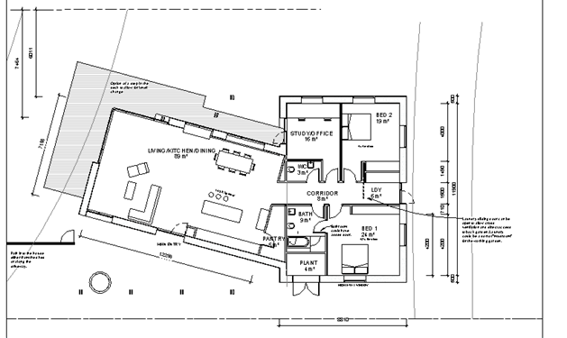
After waving some increasingly outlanding window designs at Christian and Deepti, who were no doubt wondering what they’d gotten themselves into, they came back with another new concept – tilt the entire kitchen/living/dining room.

This made the end wall of the room basically parallel to the BAL contour, maximising the size of the room without offending the council. It also introduced a ‘proper’ front door on the south side, bring the well into play as an entrance feature.
I also liked this idea as I could fence between the house and the shed in front, and leave a clear path to the front door without visitors having to brave the dog yard….because the dog yard contains this monster: